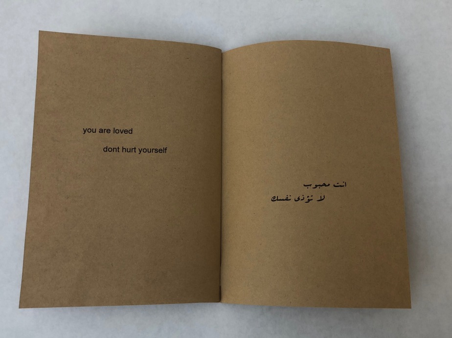
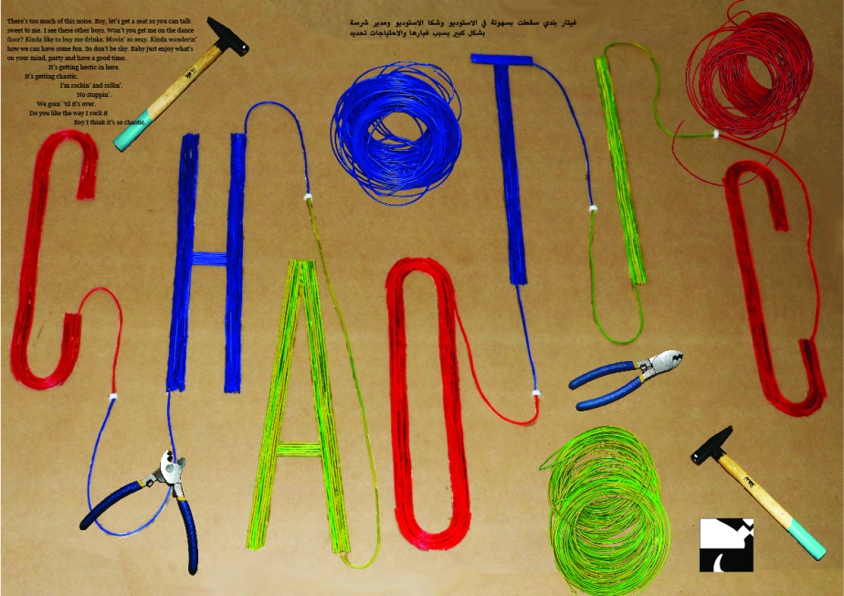
Pursuit of Happyness Title Sequence

I looked at the main places best shown to describe the movie and made a list.

  • New York
  • Streets
  • Subway
  • Homeless Shelter
  • Public Bathroom
  • Old Apartment
  • Basketball Court
  • Public Transportation (bus)
  • Taxi

Since I couldn’t go to new york and take videos I decided to print real images and use a microlens video camera to make the place look realistic, then to add contrast I wrote everything on a tracing paper. This idea is inspired by the fact that the main character constantly flips through pictures.

IMG_1286.jpegIMG_1289.jpeg

This is how I took the videos and how it looks on screen.

IMG_1287.jpegIMG_1288.jpeg

After my first critic, i got a lot of feedback regarding the paper not being aligned, some of it was on purpose but it looked like a mistake. Also, some of the text was not large enough and there was typos. Therefore i decided to fix these mistakes by retaking and reprinting the mistakes. The second time i retook them i decided to remove the board, table and everything else, so i can add the paper wherever i want without a border. I didn’t want it to be too aligned because i still wanted to look like a natural paper flip.IMG_1668.jpegIMG_1666.jpeg

These are the final scenes of my title sequence:Screen Shot 2019-04-30 at 3.12.40 PM.png

Screen Shot 2019-04-30 at 3.13.11 PM.png

Screen Shot 2019-04-30 at 3.16.39 PM.png

Screen Shot 2019-04-30 at 3.13.25 PM.png

Screen Shot 2019-04-30 at 3.13.28 PM.png

Screen Shot 2019-04-30 at 3.13.34 PM.png

Screen Shot 2019-04-30 at 3.13.39 PM.png

Screen Shot 2019-04-30 at 3.13.55 PM.png

Screen Shot 2019-04-30 at 3.14.01 PM.png

Screen Shot 2019-04-30 at 3.14.08 PM.png

Screen Shot 2019-04-30 at 3.14.13 PM.png

Screen Shot 2019-04-30 at 3.14.19 PM.png

Screen Shot 2019-04-30 at 3.14.23 PM.png

Pursuit of happyness poster

The movie i decided to go for is one of my favorites which is the pursuit of happyness.

I first did 15 sketches focusing on the main things i noticed from the movie.

  • Not giving up
  • Education
  • Poverty
  • Power
  • Fatherhood

I used these key point to use for my sketches:

Screen Shot 2019-03-01 at 3.56.10 PM.png


I used these sketches to, later on, expand them for my final idea, I wasn’t satisified with the brown color choice so i focused on black, white and red.

I focused on the rubix cube, quotes, actors and bone density scanner and they were the final highlights from the overall movie.

I first started with the rubix cube image, it was too colorful and didn’t match my color choice to I photoshopped it to make it match and used this image for my rasterized.shutterstock_630799220.jpgRubix cube edited.jpg

POSTER 2 pursuit of happyness.jpg

I later created 3 Persuasive posters focusing on will smith’s face but decided to go with the first one only:PURSUIT OF HAPPYNESS POSTER 1.jpgposter 5.jpg

poster 3 Pursuit of happyness.jpg

I also created a bone density scanner but no one knew what it meant to i decided to remove it entirely:poster 4 .jpg


So for my final 3 posers, I had the Persuasive and Pragmatic but I noticed I didn’t have poetic which is why I took a famous quote from the movie and used it for my final poster:

Final Persuasive:

Persuasive persuit of happyness final.jpg

Final Pragmatic:Pragmatic Persuit of happyness  FINAL.jpg

Final Poetic:poetic pursuit of happyness FINAL.jpg

Print 2 Dairy Packaging

The Packaging I’m creating gives very aesthetic pleasure. It is very minimal and expensive looking. Therefore, my target audience is more high-end mature adults that care about their image. The audience would assume the product’s quality is better because of the packaging. It is more for people that would shop for groceries at Monoprix rather than Lulu Hypermarket. My packaging is not going to include flashy colors, the colors I’m going for are black and white, maybe blue and grey, therefore, it is going to be considered very boring to younger people, but sophisticated to adults.

I first started with the logo, I mixed calligraphy and minimal together and created this:

final logo laiterie blance .jpg

For the packagings, I create ‘one line’ drawing illustrations of the animals:

one line drawing.jpg

I first created digital mockups:

Milk packaging.jpg

dairy instagram post3 .jpg

and then I created the real mockups:

Patterns

For our color scheme, we were inspired by the colors of the ocean plants because they are very colorful and blend well together.

Screen Shot 2019-01-31 at 2.55.20 PM.png

I looked for many inspirations for my patterns and I wanted to use all the colors from the color scheme, I found that I was mostly inspired by lines and liquid marble designs. With these 2 I was able to create many different patterns. I mainly wanted them to blend together and not give the repetitive look. I also didn’t want it to look too nautical. So I was able to make it look beachy without using any shapes inspired by the actual beach.

Screen Shot 2019-01-31 at 2.50.12 PM.png

For my Rasterized images, the first image was inspired by the brush stroke and this is what I ended up with.

Screen Shot 2019-01-31 at 2.58.58 PM.pngScreen Shot 2019-01-31 at 2.57.36 PM.pngScreen Shot 2019-01-31 at 3.00.03 PM.png

The second Rasterized image was inspired by Japanese liquid ink:Screen Shot 2019-01-31 at 3.02.46 PM.pngScreen Shot 2019-01-31 at 3.02.23 PM.pngScreen Shot 2019-01-31 at 3.03.17 PM.png


As For the vector Patterns

The third pattern was inspired by lines:

Screen Shot 2019-01-31 at 3.05.23 PM.pngScreen Shot 2019-01-31 at 3.05.50 PM.pngScreen Shot 2019-01-31 at 3.06.18 PM.png


The fourth pattern was inspired by wavey lines:

Screen Shot 2019-01-31 at 3.07.54 PM.pngScreen Shot 2019-01-31 at 3.08.38 PM.png Screen Shot 2019-01-31 at 3.11.05 PM.png


The final pattern was inspired by strokes:

Screen Shot 2019-01-31 at 3.11.57 PM.pngScreen Shot 2019-01-31 at 3.12.08 PM.pngScreen Shot 2019-01-31 at 3.12.34 PM.png


Darna Project and Packaging

Over the past few weeks, the things I learned helped me improve remarkably as a graphic designer. I learned the difference between CMYK and RGB, how to deal with print vendors, how to print any packaging without guidelines, I also learned how they create Varnish on packaging and The difference between Vector and Raster Images. On our trip to The Sharq Printing Press, I saw how all the magic happens, they have a machine for almost everything (printing, folding, stickers, books, etc…).

The Darna Project 

As any group project, we had many ups and downs, a lot of agreements as well as disagreements, I had to learn to make the best out of any situation. Our Concept is very interesting following a very cultural approach with a twist. As a high-end restaurant, I was able to experiment on how I could make it show, by creating laser-cut packaging as well as my glass with gold, coffee packaging. I learned to create very interesting Islamic patterns and well as experimenting with different fonts.

Packaging

For my final Packaging, I decided to create a Darna Bag, I went after this approach because I wanted to do something you wouldn’t usually see at any restaurant which is to take the Darna logo icon and use it as the bag’s handle. The Islamic Pattern was used on the outside as well as the inside of the package.

IMG_6759.jpeg

IMG_6758.jpeg

Collateral

For my Collateral I decided to do a Darna Cold Arabic Coffee using a glass packaging with a Gold lid, For the Coffee Packaging I printed out two stickers one is for the glass and one is for the lid. I also did a Darna Business Card with the patterns I created for the back.

IMG_6776 2.jpeg

IMG_6784.jpeg

Design manual draft

This is the layout I did for the design manual, I still didn’t choose how I’m going to add the colors as its slightly hard to work with the color schemes and still make it match the design itself. I’m satisfied with the typography and the layout I created for the manual but I still need to add all the content and work more on the design of the manual itself.

design manual

Flaws Book Cover

flaws book cover

For my book cover, I had a lot of fun as I experimented with so many materials to come up with my final results. I first started with the word “Confront” and experimented with a lot of materials that relate to the word. I thought working with mirrors/metallics would make sense as it is the first thing that comes to mind when I hear the word.

The best effect was getting a metallic paper and make the letters out of foil, it gave it a very 3D effect and I also wanted to experiment with lighting. I made the image Black & White and worked a lot with the contrast and the lighting using photoshop. The word I made was “flaws” because when I first hear the word confront I think of “Confronting my Flaws”, it has a very deep and meaningful meaning behind it.

The overall outcome was visually appealing to me, I am pleased with the effect that foil with light gave me. The book title is perfect. I couldn’t find a lot of information behind the book but I was able to make it seem as interesting as possible.

Everything is going to be Okay – Design form and communication

This book is detected to help those kids from the age of 12 to 24 that suffer from abuse here in the middle east. The whole aim of the book is to motivate them to become stronger and help them deal with it.

The book is a total of 18 pages, both in Arabic and English. The title is called “Everything is going to be Okay”. I started the book with the most important message “First things first, understand how strong you are, you will survive, you will get through this, you will be happy. This is all temporary.”

I printed important reminders and posted them on post-it notes. Each post-it note had a different message and I asked the reader to post a post-it note on the mirror every day this is a known technique to help with self-love and confidence.

I made a to-do list page, to remind the reader there are many fun things you can do at home to distract yourself after that I gave the reader the option to create their own to do list.

I added a few quotes with Arabic translations that I know the reader wants to hear.

I wanted the reader to know that they are loved even if it’s not inside the household and they can always pick up the phone and call a close friend when they are feeling down.

Since the target audience is middle eastern kids I added a watch list full of hilarious Arabic plays which make every middle eastern kid laugh.

I ended the book with both an Arabic and English quote that says “you are loved, don’t hurt yourself”.

My final Outcome:

IMG_3182.jpgIMG_3183.jpgIMG_3184.jpgIMG_3185.jpgIMG_3186.jpgIMG_3187.jpgIMG_3188.jpgIMG_3196.jpgIMG_3190.jpgIMG_3191.jpgIMG_3192.jpg


FINAL POSTER

We were supposed to combine the final sentence, logo and paragraph into the final poster.

i decided to go with this logo as it was my favorite.

letter 1.png

This is the paragraph i wanted to go for because it perfectly described the chaotic situation and it was the best one out of the final paragraphs.

hessa_a4_final.jpg

This is the final sentence i wanted to go for.

Screen Shot 2017-12-05 at 11.23.38 PM.png

After looking at the final image and tried to combine everything i was too afraid to take risks so i went for an approach that was too safe. This is what i came up with.

chaotic draft for blog.jpg

i wasn’t satisfied with the outcome and after the critique i found out why. everything is in the corners which made it look boring. the black text made the poster look dull and slightly unreadable. the sentence and logo aren’t following a specific path and finally the logo was too big. The main problem was the placement of everything

So for my final i decided to fix all the mistakes, the sentence is following the hammer’s path and the logo is following the other hammer’s path while the sentences is perfectly placed on the wires.

Here is my final poster.

final chaotic poster.jpg

REALITY VS HEAVEN

About our project:

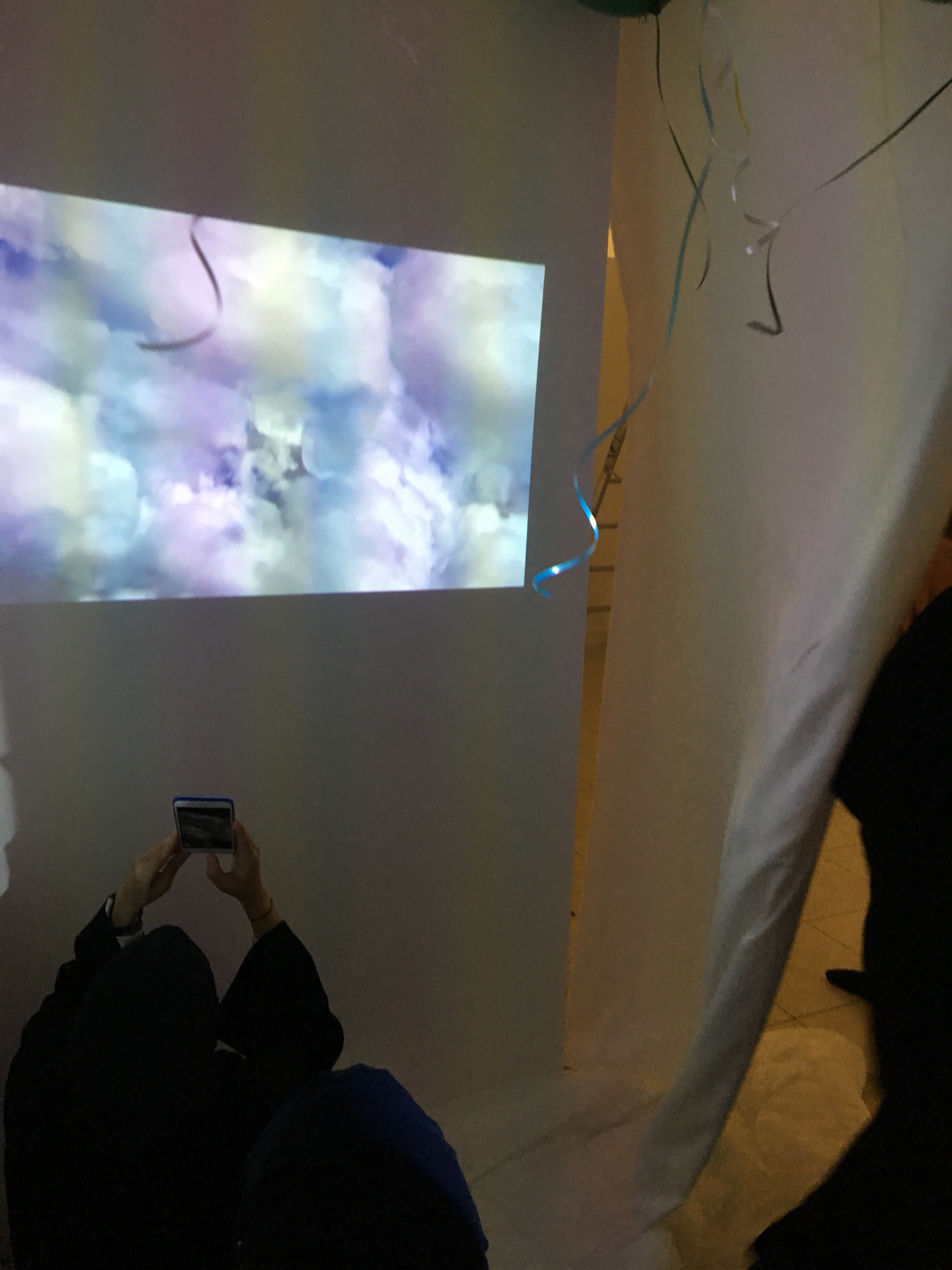
                  The intention behind this exhibition experience is to allow audience members to experience the difference between reality and heaven. Inspired by the featurette The Red Balloon, the exhibition will integrate two different experiences. The first will involve a challenge in which audience members will have to pop a giant red balloon using darts. However, this challenge will be harder than audience members may expect given that the darts’ tips will be treated so they are not sharp. The second experience will involve a small enclosed space; there will be two walls and curtains; there will also be projectors for recreating a realistic sky. The idea is to make the audience believe that they are inside of The Red Balloon movie and actually flying.

It is important to note that The Red Balloon is a featurette that uses the red balloon as a symbol of dreams and how there will always be people who will seek to puncture said dreams. During the exercise of throwing darts at the red balloon, an attempt will be made to (symbolically)show to the audience that dreams are meant to be strong to withstand adversity if they are ever to materialize into reality. The symbolism of dreams will only be further stressed in the exhibition’s second experience. The intention will be to make the audience believe that they are flying, very much in the same way that people feel they are flying when they are dreaming (and also when they are making their dreams come true).

Process:

at first we built the L shaped walls and covered them in fabric to create 2 rooms we also painted the walls black from the outside and added black carpets to match.

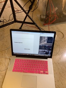
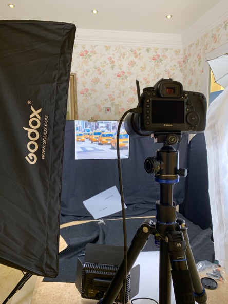
After that we wanted to start with the design so we added fake clouds. Part of the design was using projectors and balloons. We borrowed projectors and i edited a video that makes the viewer experience realistic clouds and the feeling of flying.

Here is the video i made with a calming piano soundtrack that the projectors are going to display.

I got giant balloons just like the ones in the movie they were extremely hard to find.

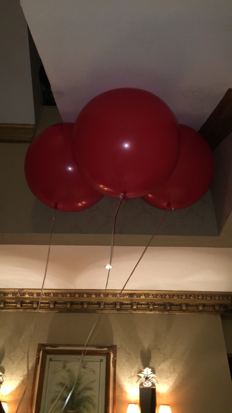
For the first “pop the balloon” challenge we got darts but i took the darts to the jewelry shop to remove the sharpness of the darts for it to make it slightly harder for the audience to pop the balloon.

i made the text with the “impact” font and i used illustrator to make an illustration of the red balloon to place it next to “pop the balloon” text and i used a sticker machine to make it easily stick to the wall.

We spray painted one of the fans white so it can blend with the room.

I got colored balloons inspired by the last seen so each person can leave with a balloon and i cut the stings short so it does not effect the projectors or cover the film or get stuck to the fans.

I was extremely proud and satisfied with the final outcome because not only did we let people experience the movie but we got to see them have so much fun doing so too. Everyone was so competitive during the “pop the balloon” challenge and they were screaming inside because the felt the wind and the flying balloons.